
 Suzi Smart Bear
There’s a persistent myth in web design that accessibility means sacrificing creativity. That making your website work for disabled users means settling for plain, boring, text-heavy pages with no personality or visual appeal. It’s time to demolish this myth once and for all.
Accessible websites don’t have to be boring. In fact, some of the most visually striking, creative, and engaging websites on the internet are also highly accessible. The truth is that good accessibility and good design aren’t opposing forces – they’re natural partners that, when combined thoughtfully, create better experiences for everyone.
Why the “Boring Accessibility” Myth Persists
This misconception exists partly because some designers genuinely don’t understand accessibility principles, and partly because we’ve all seen badly implemented accessible websites that prioritise compliance over experience.
When designers don’t properly understand accessibility, they make assumptions:
- “We can’t use colour because some users are colourblind” (wrong – you can use colour, you just can’t rely on it alone and it needs a use-strategy).
- “Animations break accessibility” (wrong – poorly implemented animations do, but thoughtful motion can enhance understanding).
- “Accessible websites must be text-only” (absolutely wrong – images, video, and visual design are fine when implemented accessibly).
The result? Designers either ignore accessibility entirely or approach it as damage limitation, creating minimal, overly cautious designs that strip away personality in the pursuit of compliance. Neither approach serves users well.
What Accessibility Actually Requires
Before looking at beautiful accessible websites, let’s clarify what accessibility actually demands:
Proper structure and semantics – Using heading tags correctly, proper HTML elements, logical reading order. This is invisible to sighted users but crucial for screen readers.
Sufficient colour contrast – Text must be readable against its background. This doesn’t mean “don’t use colour” – it means use colour thoughtfully with adequate contrast ratios.
Keyboard accessibility – All functionality must work without a mouse. This doesn’t restrict visual design at all – it’s about ensuring interactive elements can receive keyboard focus.
Alternative text for images – Descriptive alt text for meaningful images. Decorative images can be marked as such. This doesn’t limit which images you use., although it’s good practice to avoid adding images just for the sake of it as they will impact load time/speed.
Clear focus indicators – Users navigating by keyboard need to see where they are. This can be styled beautifully – it doesn’t have to be an ugly blue outline.
Flexible text sizing – Content must remain usable when users increase text size. Good responsive design handles this naturally.
Captions and transcripts – For video and audio content. Purely technical requirement, doesn’t affect visual design.
Notice something? None of these requirements prevent creative visual design. They’re about how you implement design, not what that design looks like.
Beautiful, Accessible Websites That Prove the Point
Let’s look at real examples of websites that are both highly accessible and visually stunning.
Slack
Slack’s website combines bold colours, dynamic layouts, playful illustrations, and smooth animations – all while maintaining WCAG AA compliance. They use colour purposefully (never as the only means of conveying information), ensure all interactive elements are keyboard accessible, and provide excellent focus management throughout.
Their design is energetic, modern, and completely on-brand while being genuinely accessible to diverse users.
Microsoft’s Inclusive Design Resources
Microsoft’s own accessibility and inclusive design pages showcase what’s possible when accessibility drives design decisions from the start. Beautiful imagery, thoughtful colour palettes, clear information hierarchy, and innovative interactive elements – all fully accessible.
They demonstrate that inclusive design thinking often leads to more creative solutions, not more limited ones.
Bulb Energy (before acquisition)
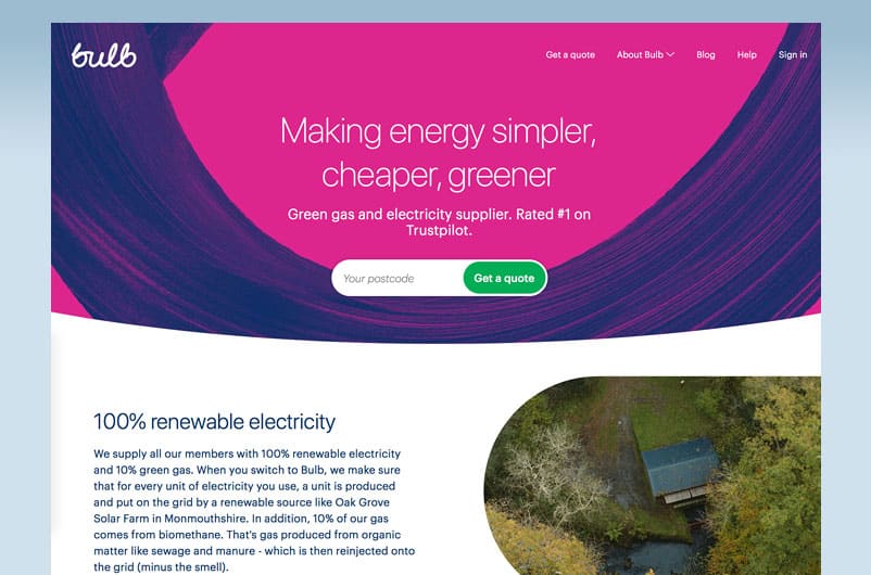
The sustainable energy company’s website was vibrant, friendly, and distinctive – bright greens, playful illustrations, clean layouts – while maintaining strong accessibility standards. They proved that accessible design could be warm, approachable, and full of personality.
The A11Y Project
A community-driven resource for web accessibility itself has a thoughtfully designed, visually appealing website. Clean, modern design with excellent use of colour, typography, and layout – demonstrating that even websites about accessibility can be beautiful.
DADA
DaDaFest , the UK’s leading Deaf and disability arts organisation, demonstrates that accessible design can be bold, creative, and unapologetically distinctive. Their website combines vibrant imagery celebrating disabled artists, strong visual hierarchy, and dynamic layouts – all while meeting rigorous accessibility standards. The design reflects the organisation’s commitment to disability arts and culture, using colour confidently, showcasing powerful photography, and creating an engaging visual experience. What’s particularly noteworthy is that DaDaFest’s accessibility isn’t just technical compliance – it’s embedded in their design philosophy. From clear navigation and keyboard accessibility to proper heading structures and excellent colour contrast, every element works for diverse users including the Deaf and disabled artists and audiences they serve. Their website proves that when disability-led organisations design with accessibility as a core value rather than an afterthought, the result is both functionally excellent and visually compelling.
Graeae Theatre Company
Graeae , Britain’s pioneering force in disability-led theatre, has a website that’s as bold and creative as their performances. The design features striking theatre imagery, dynamic content layouts, clear typography, and a confident use of colour – all while being fully accessible to disabled users. As a company that’s been championing accessibility in the arts since 1980, Graeae understands that accessible design should be exciting, engaging, and representative of the vibrant creative work they produce. Their website successfully balances visual impact with practical usability: images have descriptive alt text, videos include captions, navigation is keyboard-friendly, and the colour scheme maintains excellent contrast throughout. The site demonstrates that organizations centered on disability arts don’t create “safe” or “basic” websites – they create designs that reflect the creativity, boldness, and innovation of the disabled artists they platform. Graeae’s website is proof that accessible design can be as theatrical, dramatic, and visually arresting as the work it represents.
Principles for Beautiful, Accessible Design
Based on these examples and broader accessible design best practices, here are principles for creating websites that work for everyone without sacrificing creativity:
Start with accessibility, not retrofit it. When you build accessibility in from the beginning, it influences design decisions in productive ways rather than restricting them. The constraint of “must work for diverse users” often sparks more creative problem-solving.
Use colour boldly, but never alone. Vibrant colour palettes are fine – just ensure sufficient contrast and never rely solely on colour to convey meaning. Combine colour with text labels, icons, patterns, or position.
Embrace clear hierarchy. Good information architecture benefits everyone. Clear headings, logical flow, and obvious navigation enhance usability for all users while being essential for screen reader users.
Design focus states beautifully. Instead of accepting default browser focus outlines, design custom focus indicators that match your brand. A well-designed focus state enhances your design rather than detracting from it.
Motion with purpose. Animations can enhance understanding and delight – just ensure they’re not the only way to convey information, users can disable them if needed (prefers-reduced-motion), and they don’t trigger vestibular disorders.
Typography as a design feature. Accessible text sizing and spacing requirements actually encourage better typography decisions. Generous line spacing, appropriate font sizes, and clear typeface choices improve readability for everyone.
Test with real users. Beautiful accessible design emerges from understanding how diverse people actually use websites. Involve disabled users in your design process – their insights often lead to better solutions for everyone.
The Business Case for Beautiful Accessibility
Beyond the moral imperative of inclusion, there are practical reasons to prioritize accessible design:
Larger audience. One in five people in the UK has a disability. Accessible design also benefits older users, people with temporary impairments, and anyone using devices in challenging contexts.
Better SEO. Many accessibility best practices (proper heading structure, descriptive link text, alt text, semantic HTML) align perfectly with what search engines need to understand and rank your content.
Legal compliance. The Equality Act 2010 requires reasonable adjustments for disabled people. Accessibility isn’t optional for UK businesses—but it doesn’t have to mean boring design.
Brand differentiation. Most websites still have significant accessibility barriers. Being both beautiful and accessible sets you apart and demonstrates genuine commitment to inclusion.
Future-proofing. Accessible design is more robust, maintainable, and adaptable to new technologies and contexts.
Moving Forward: Designing Inclusively
The next time someone suggests that making your website accessible means making it boring, show them this blog. Point out that some of the most awarded, most successful, and most beloved websites are also highly accessible.
Accessible design isn’t about limitation – it’s about thoughtfulness. It’s about making conscious decisions that work for diverse users rather than defaulting to approaches that only work for some. That thoughtfulness, that intentionality, almost always leads to better design outcomes.
Your website can be vibrant, creative, distinctive, and memorable while also being accessible to screen reader users, keyboard navigators, and people with visual, motor, or cognitive disabilities. These goals aren’t in conflict – they’re complimentary.
How this affects Small Businesses and Charities
Ok, I’m not going to lie, if you’re on a tight budget, using a platform that isn’t that accessible or stuck with inaccessible branding as you can’t afford a rebrand, then you may have to make some compromises when it comes to the design – and that might be to strip out some animation or choose design elements to prioritise speed or accessible navigation. At this point, functionality for your users is far more important than it looking pretty.
But, beautiful, accessible design isn’t just possible. It’s better design for all businesses. And the websites proving this every day are anything but boring so let’s give it our best shot with the budget we have!