Website accessibility is important so your website is inclusive for all users – including those with disabilities.
Whilst making sure your website is accessible is part of The Equality Act 2010, as it’s not actively monitored, many businesses don’t ensure compliance.
Most premium themes don’t have accessibility built in and so, for many small businesses, the expense of this extra step on top of everything else is just prohibitive so accessibility goes by the way-side.
Nevertheless, if you’d like to try and make your website more accessible, here is our 10 step guide to help you. And, as an extra bonus, it will help make your website more search engine optimised, helping you rank better too – which is a win/win!
1. Use heading tags
Heading tags are used for titles and sub-titles, and are sometimes called header tags. In code form they look like this;
<h1>Title </h1>
<h2>Sub Title</h2>
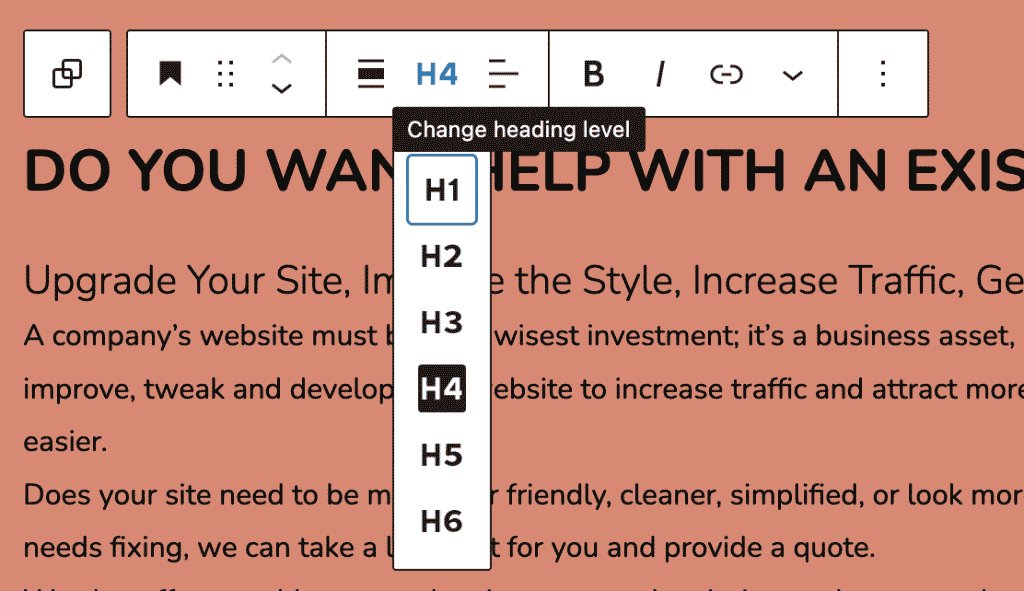
But in the Gutenberg editor on WordPress, creating heading tags look like this;

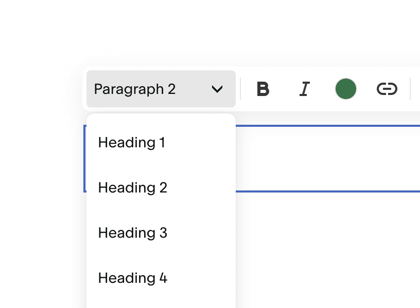
And on other editors may look something like this;


These are used for helping to section the text for screen-readers – and skim readers alike.
They should be used in a strict format so you can go in order
H1
H2
H3
H2
H3
H4
But you shouldn’t go
H4
H2
H3
H1
You should only have 1 H1 on a page unless it’s very long and all heading tags should contain at least one keyword (for SEO), but remember not to shove them in if it doesn’t make sense to do so.
2. Use ‘alt tags’ for images
Alt tags are not seen on the front end but help describe the image for both screen-readers and google. They should contain a description of the image but you can put keywords in this area as well.
Alt tags can be found when uploading the image or editing the image (in the media library on WordPress) but on other platforms, they may be called ‘image title’.
3. Use captions
If you have video or audio content on your website, ensure that you provide a caption or downloadable transcript for people with hearing difficulties. And of course, for Google to be able to read the content.
There are tools that will do it for you – and will also embed it into your video as subtitles, or you can manually type it out.
4. Avoid tables
Make sure if you have tables that all the columns/rows have headings but if you can, avoid tables altogether as they are hard to read. Try using lists or another format to convey the same information.
5. Structure links
When using text links, try and avoid ‘click here’ as these can be confusing when read by the screen-reader. Instead use a short description and consider reading it aloud to see if it works.
Always make links obvious – consider the old-skool method of underlining them – and you can use link titles, which forms part of the link code, to add more information.
6. Formatting documents and downloads
Give any documents, downloads and images meaningful names and try not to use abbreviations or acronyms. If you do have to use technical or industry terms, consider a terminology glossary that can be easily found on the same page or via the menu/navigation.
7. Using colour appropriately
If you’re using colour, ensure that the contrast is high enough for people with sight difficulties. This can easily be checked using a contrast checker such as;
- Colorable link: https://jxnblk.github.io/colorable/demos/text/?background=%23FEDC2A&foreground=%235A3B5D
- Who can use link: https://whocanuse.com/?b=fedc2a&c=5a3b5d&f=20&s=
- Accessible Colors link: https://accessible-colors.com/
- Accessible Color Matrix link: https://toolness.github.io/accessible-color-matrix/?n=white&n=Color%202&n=Color%203&n=Color%204&n=Color%205&v=FFFFFF&v=FEDC2A&v=5A3B5D&v=8B538F&v=C3A3C9
- Color Review link: https://color.review/check/FEDC2A-5A3B5D
If you’re using colour to signify meaning, for those with colour-sight issues this might be difficult so you may want to use another form of indication. For example, a red outline on an error box might not be seen so include an icon and or text to advise there is an error, instead.
Use colour backgrounds and sections to help people with dyslexia and other conditions like neurodiversity – the best options are muted tones, pastels, neutrals or green/blue (blue overlays can also help dyslexia). Yellow, in general, is heavily sensory-loaded, so should be used sparingly.
8. Choice of fonts
Try to use plain fonts sans-serif, ‘humanist’ fonts, or monospace fonts) where possible- at the very least for the body of text ( and avoid italics or justifying text blocks. There are even 2 specific dyslexia fonts called Open Dyslexic and Dyslexie. Also, use larger fonts where possible and 1.2 line spacing.
9. Review Forms
Forms these days tend not to have labels but have placeholder text inside the input fields instead – which I know looks much better design wise but sadly they aren’t accessible and are difficult to navigate.
Also keep the number of fields to a minimum – do you need to ask everything on that form or is it just ‘nice to have’ information.
10. Avoid flashing/ distracting animations
Neuro-diverse people may struggle with lots of flashing distractions on a page so try to keep them to a minimum where you can. They can often slow the website down as well which can affect your Google ranking.
WordPress Plugin options
For WordPress users, there are a range of plugin options that will help – especially for those who can’t make many changes to their theme. These will help with things like, contrast, making text bigger or smaller, changing the font to a more readable one, making the background light or dark or turning the whole site greyscale for the user. There are also ones that remove all the images and styling, leaving just the text.
Here are a selection of plugin options free from the WordPress plugins library:
- One Click Accessibility link: https://en-gb.wordpress.org/plugins/pojo-accessibility/
- WP Accessibility link: https://en-gb.wordpress.org/plugins/wp-accessibility/
- WP Accessibility Helper (WAH link): https://en-gb.wordpress.org/plugins/wp-accessibility-helper/
There are also a range of freemium and premium options if you want something more specific.
Bionic Reading for WordPress
So I couldn’t write this blog without mentioning Bionic Reading ….
Bionic Reading helps people read faster and seems to let the reader have more of an understanding of what they’re reading.
It’s popular amongst the neurodiverse, who report to find it a lot easier.
The good news is there is now a Bionic Reading plugin for WordPress that will convert text using the Bionic Reading API but it comes with a caveat – there’s a cost attached to using the API for any significant purpose. The free version just isn’t enough for most business websites and so you will need to invest if you want to offer this facility.
We have decided, for now, not to offer it to our readers, but that might change in the future……..
However! there is a chrome extension available free to everyone which will easily translate text-heavy websites into the Bionic Reading format, so it’s not all bad news.

